

The Story Behind our Logos
“Most people don’t see the turtle at first…”
The Redding Tai Chi Meditation Garden will be situated in the McConnell Arboretum & Gardens at Turtle Bay Exploration Park. Keeping this location in mind, the designer of our logo integrated the park’s prominent feature, the Sundial Bridge, with the Yin Yang symbol. In Chinese culture, the Yin Yang symbol is referred to as the “Tai Chi” diagram, from which the exercise of Tai Chi derives its name.
Our logo, however, offers more than just these elements. While the Yin Yang symbol typically consists of matching halves with an “S-shaped” line between them, in our logo, the white segment has transformed into the head of a turtle, with the darker part representing its shell. You may notice three legs and a small tail as well. The turtle might not be immediately apparent, but once you’re aware of it, it becomes impossible to miss. The final design of our logo beautifully incorporates the Sundial Bridge, the Tai Chi symbol, and the representation of a turtle, symbolizing Turtle Bay Exploration Park.
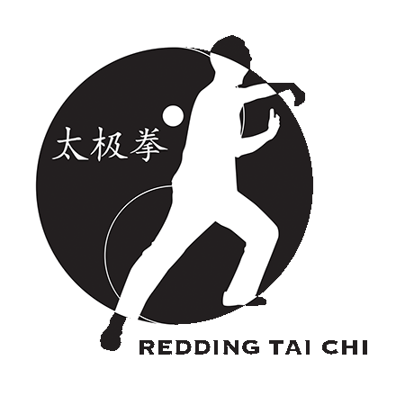
The Redding Tai Chi logo embodies the concept of complementary opposites, which forms the essence of the Tai Chi exercise. The contrasting colors of black and white traditionally symbolize the Tai Chi emblem, from which the exercise derives its name. Featuring the Chinese characters for Tai Chi Chuan (Pinyin: Taiji Quan) and a figure executing the Tai Chi movement known as “Single Whip,” the logo captures both the essence and the historical origins of the practice. Both the Redding Tai Chi and the Redding Tai Chi Meditation Garden logos were created by the artist and Industrial Designer, Hannah Czehatowski.
